

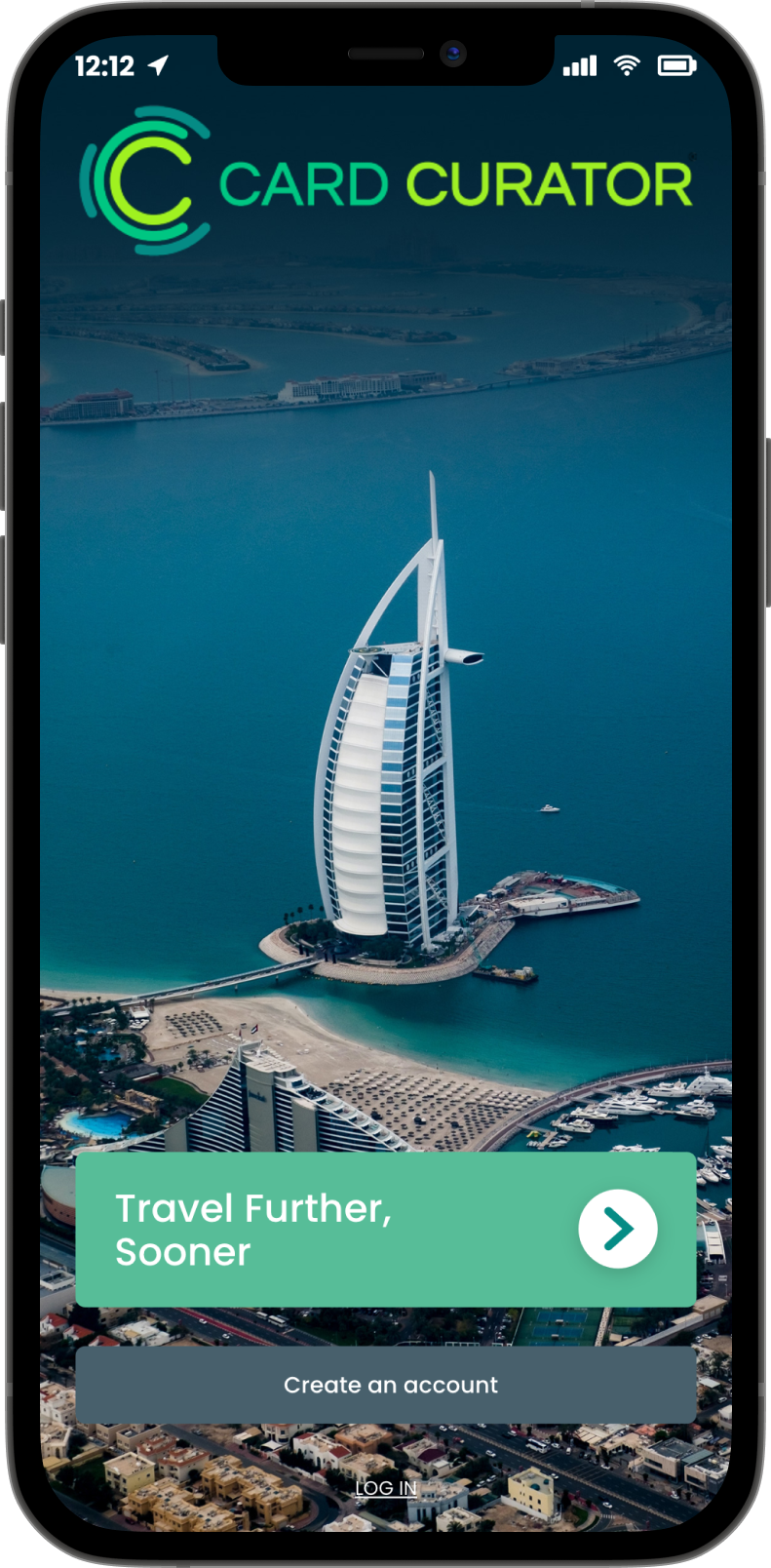
Card Curator
Designing mobile app onboarding for free, luxury travel.
-
Time
4 Weeks
-
Team
Product Manager
Product Designers
Product Developers
-
Role
Research
UX
-
Deliverables
User Flow
Wireframes
Usability-Test Reports
Card Curator’s mobile app enables users to travel the world far, fast, and free.
We designed Card Curator’s new onboarding process to transform app setup from tedious to inspirational.
On the first day of my Card Curator internship, I was asked to help redesign the mobile app’s onboarding process for the platform’s upcoming update. This case study displays my design process from initial ideation all the way to handing off wireframes to Card Curator’s development team.
BACKGROUND
Card Curator uses CardArb™, a proprietary algorithm, to help users automatically earn 5-10% more on their spending through credit rewards points and miles.
More rewards = more cash back and more miles without increasing spending.
PROBLEM
Lack of Demonstrated Value Proposition
While users enjoyed Card Curator’s services, user research indicated that Card Curator’s selling points were often lost in the mobile app’s lengthy and confusing setup.
The app’s setup also requires linking credit card activity. Without demonstrated value, users were hesitant to trust the app, preventing them from using Card Curator to its full potential.
OPPORTUNITY
How might we transform a multi-step setup into a unique, satisfying onboarding process?
Efficiency, Excitement
Card Curator users have things to do and places be. They need to be able to set up their app intuitively and quickly without a snag. Free travel should feel fun and exciting from the very start—not stressful. Understanding, Trust
Card Curator's algorithm relies on credit card spending activity in order to successfully recommend which cards users should be using for different purchases. But it can be hard to trust a new service with private financial information when you don't know how that service works or what it has to offer. SOLUTION

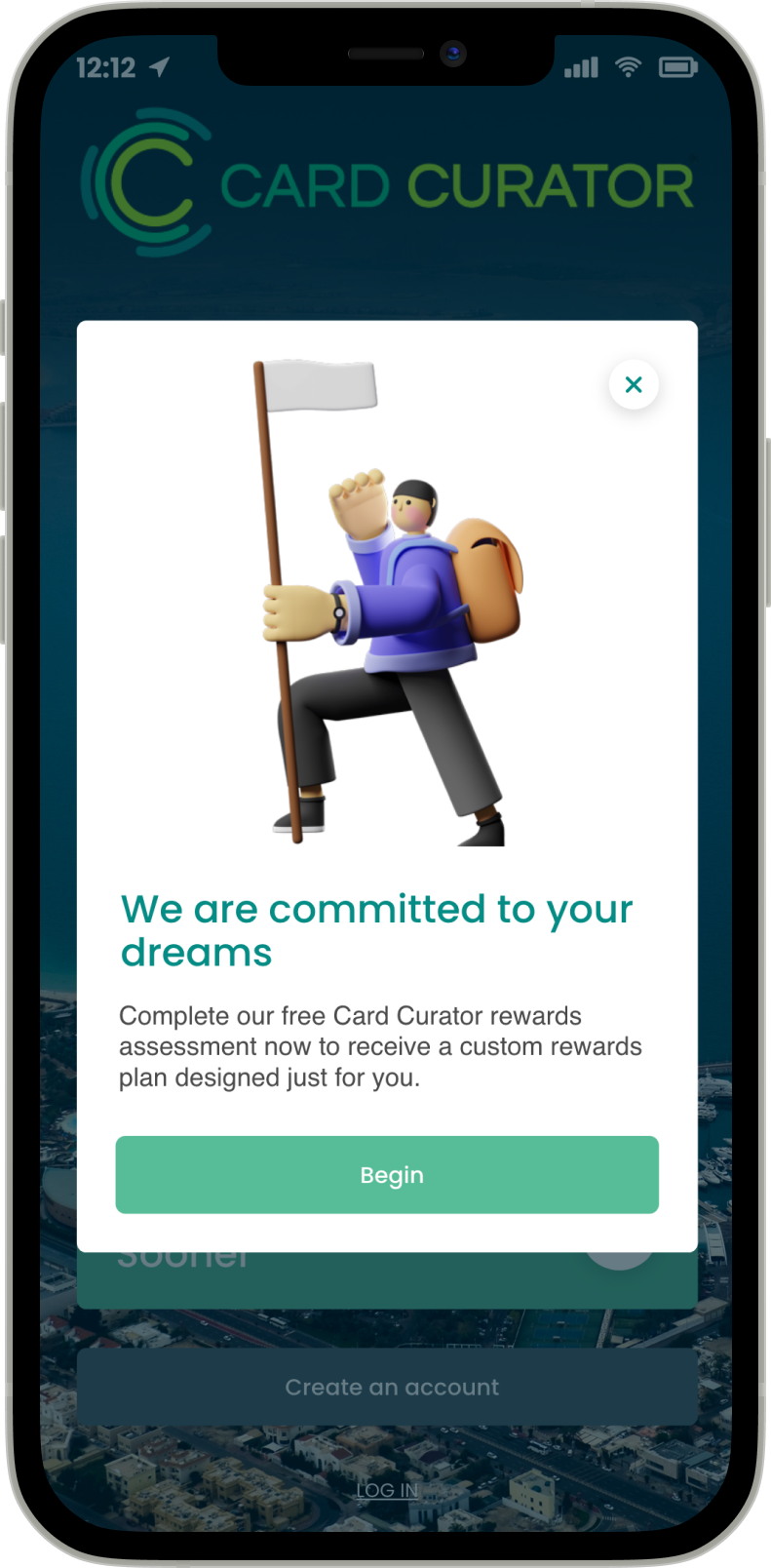
Personalized Rewards Assessment
The mobile app’s new onboarding process now begins with a personalized quiz which helps the user envision where they can travel with Card Curator. This momentum is then funneled through a streamlined setup process broken down into clear, manageable chunks.
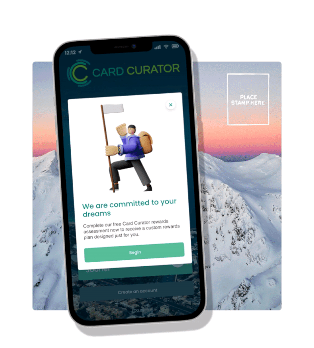
Climb onboard.
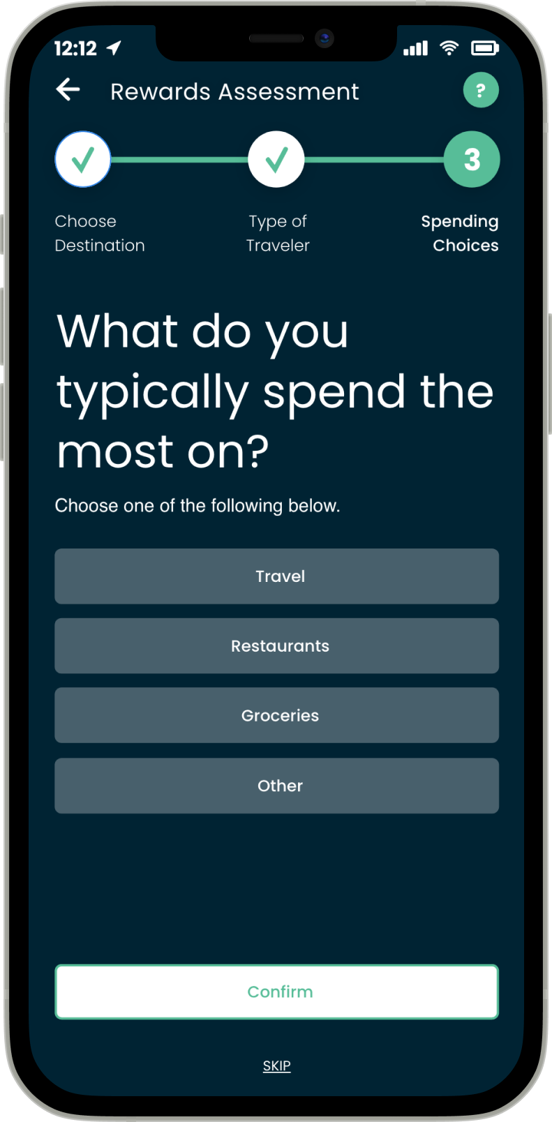
Personalized Rewards Assessment.
"Dream destination" means something different to everybody. Card Curator’s new onboarding uses this to its advantage by kicking off things off with a personalized quiz that generates a custom travel plan to get users dreaming bigger. This simple, three-question assessment enables users to see Card Curator's algorithm at work—specifically catered towards their personal travel goals—before they are asked for any personal information.
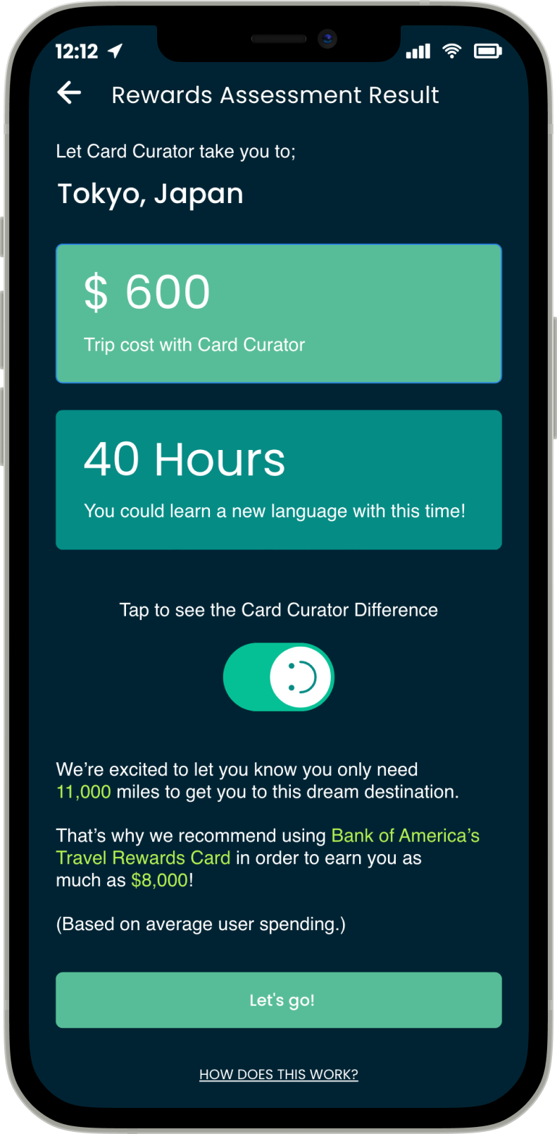
The Card Curator Difference.
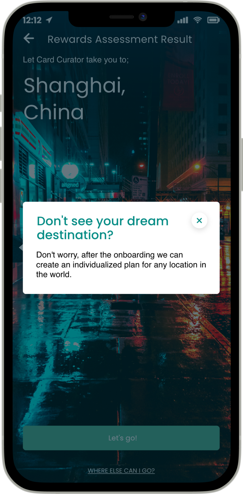
Once users have completed their Rewards Assessment, they receive a dream travel location based on their input as well as an individualized plan on how to get there. Users are able to explore other similar travel destinations if they are not satisfied with their temporary travel suggestion. Additionally, users are able to see how much time and money they are saving with a 'See the Card Curator Difference' switch button. Time and money saved are also shown in playful units such as 'New York cocktails' or 'time spent learning a new language'.
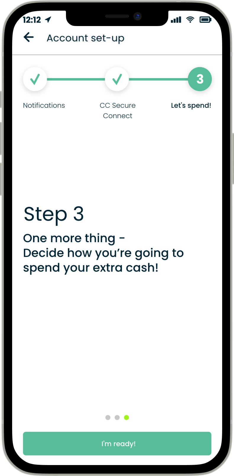
Step by Step, Bit by Bit.
Card Curator's setup process is presented to users in three easy steps. The user enables notifications, links spending activity, and is then whisked away to Card Curator's home screen, ready for spending. Users are able to see which step they are on at all times, and are presented with optional 'Tell Me More' CTAs for any questions they might have along the way.
What People Are Saying
“This quiz reminds me of buying a cool, customized beauty product, but the adventure version.”
User
“I didn’t think my wanderlust could get worse. Within the first few minutes of setting [my account] up, I learned otherwise.“
User

Onboarding for Card Curator
Gearing the fast and curious up for travel on a mobile device.
PROCESS
RESEARCH
Background
Everyone wants and deserves a little adventure in their life. Yet despite Card Curator's formidable ability to enable users to travel for free, the mobile app's lack of an official onboarding process resulted in a sharp drop of user engagement upon initial app installation. My research revealed that while users might be passionate, curious travelers, users often did not understand how Card Curator works, why so many steps were required in setup, and why credit card accounts needed to be linked.
I was struck by stories of users who finally took a step towards travelling more, but promptly swept their dream adventures back under the rug when the mobile app failed to develop understanding and retain attention.
RESEARCH
User Interviews
Card Curator's target user demographic is within the ages of 22 and 35, with an income of over $100,000 each year. In order to better understand the user experience of first downloading and interacting with the mobile app, I conducted multiple sets of First Impression Interviews within our target market. This included two main groups:
Recent college graduates with six-figure salaries who are interested in travel—ages 22-25.
Corporate or working professionals with six-figure salaries who are interested in travel—ages 25-35.
I crafted my questions in order to more deeply explore different experiences initially interacting with Card Curator's mobile app. This included any pain points or poached opportunities relating to registration, activation, or the app's preliminary tutorial .
I fed my insights into empathy maps for each conducted, and utilized Affinity Mapping in order to identify key themes in my insights.

Feelings.
“Traveling for free sounds great, but I’d need a little more assurance that this isn’t some kind of scam.”
“Of course I want to see the world, but this kind of feels like setting up a budgeting service.”
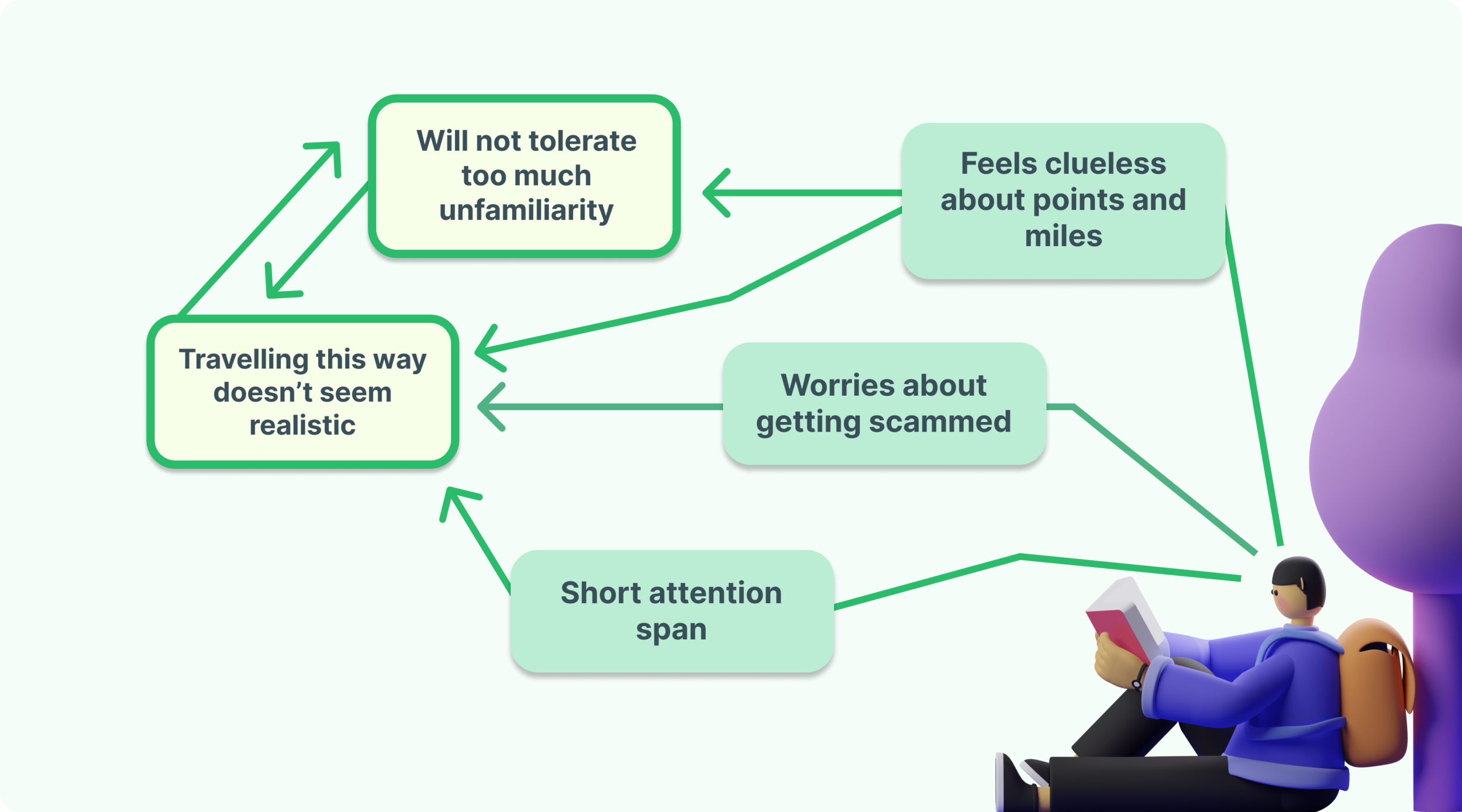
FINANCIAL DISTRUST.
Users felt skeptical being asked for their credit card information before fully understanding how they might benefit from Card Curator.
MIXED MESSAGING.
The string of steps users were asked to complete made the process feel more laborious than exciting. 
Pain Points.
“It’s weird trying to learn how to use the app when I don’t even know how points or miles really work. Like, should I do research before using this? ”
“After setup, am I supposed to know what to do?”
LACK OF BACKGROUND KNOWLEDGE.
Users who were new to the world of points and miles felt ill-equipped and hesitant to proceed through the setup process without more information because they understand what objectives needed to be accomplished and why. 
Goals.
“[This app] seems promising, but I can honestly book and pay for my own trips. If it’s not fast, it’s not worth it.”
UNCLEAR VALUE PROPOSITION.
Users did not have a clear enough idea of what exactly Card Curator could add to their life, and so they weren’t convinced that it was worth more time exploring. DEFINE
Empathy Map
User research helped me to form an overarching Empathy Map, enabling me to gain deeper insight into the layered experiences of our specific audience.
RESEARCH
Persona, Needs
From our user interviews, I created a main Persona to help represent the needs of a larger target group of users.
I synthesized my qualitative data and findings into an array of Needs in order to help define pain points.
Pain Point #1:
The current onboarding process does not demonstrate Card Curator’s value proposition enough to motivate users to take a chance on a new service.
Pain Point #2:
Points and miles seem arcane to users and any unknowns breed doubt.
DEFINE
POV Statement
Users need a trustworthy, engaging way to onboard that is both straightforward and time efficient.
IDEATE
Goals
Credible
Users need to be able to understand what the specific objectives of the onboarding process are as well as exactly why each step is important and useful.
Expedient
The solution needs to be smooth, intuitive, and exciting in order to build travel momentum.
IDEATE
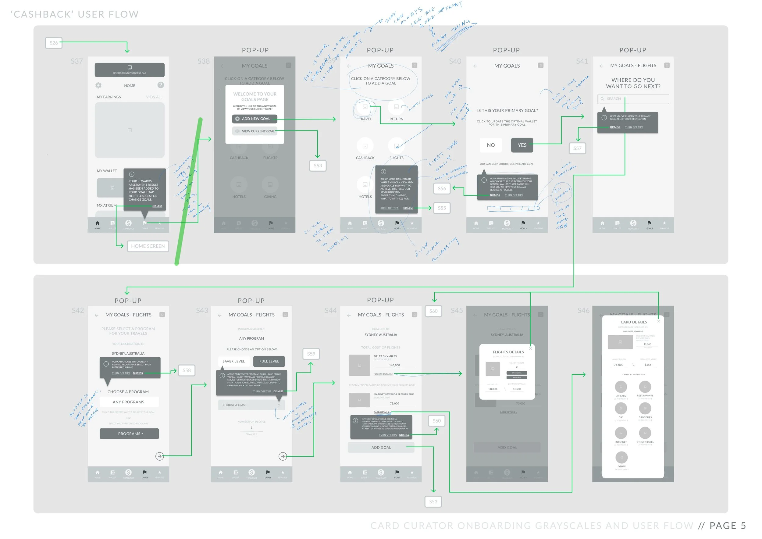
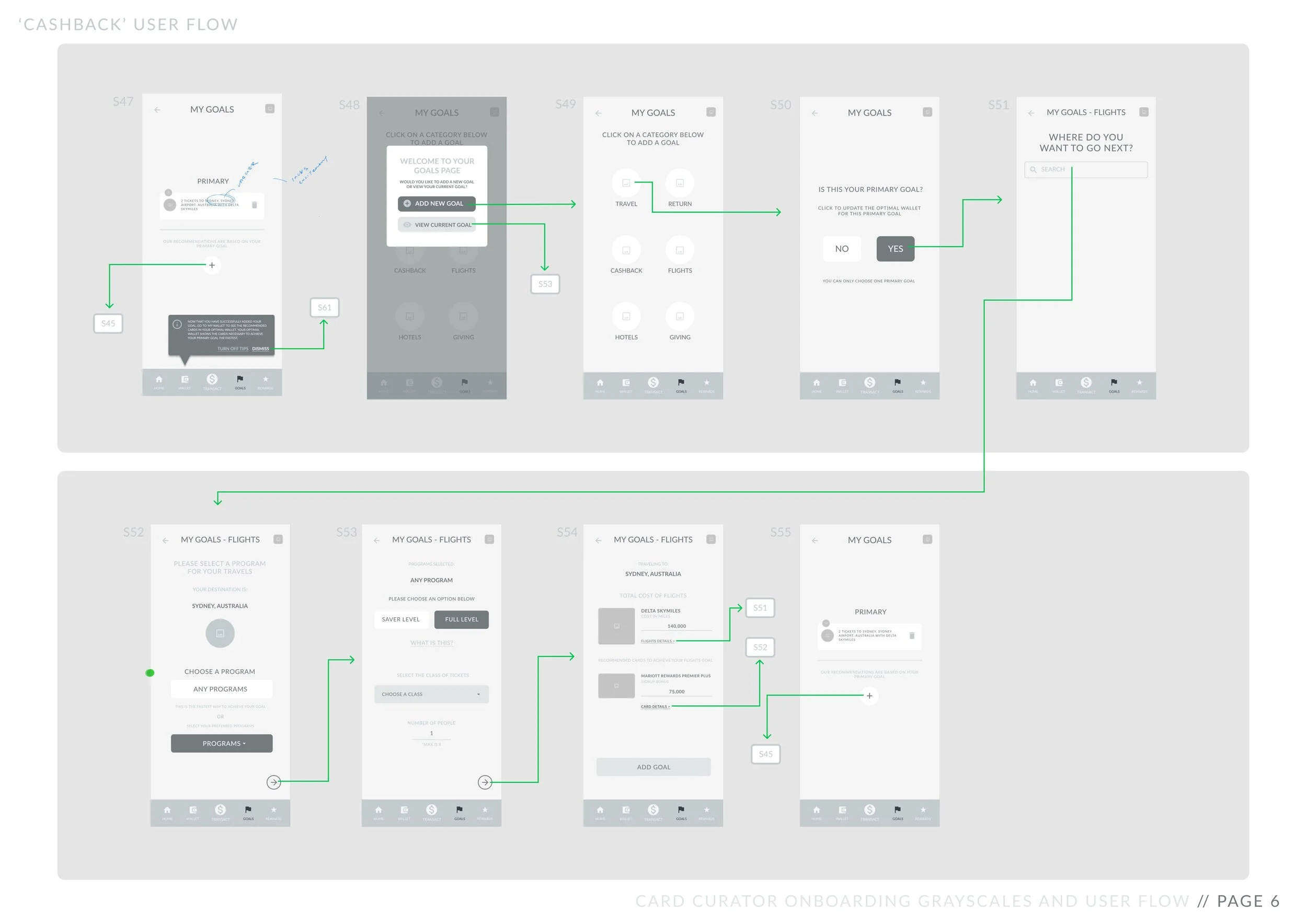
Brainstorm, User Flow,
Greyscale Mockups
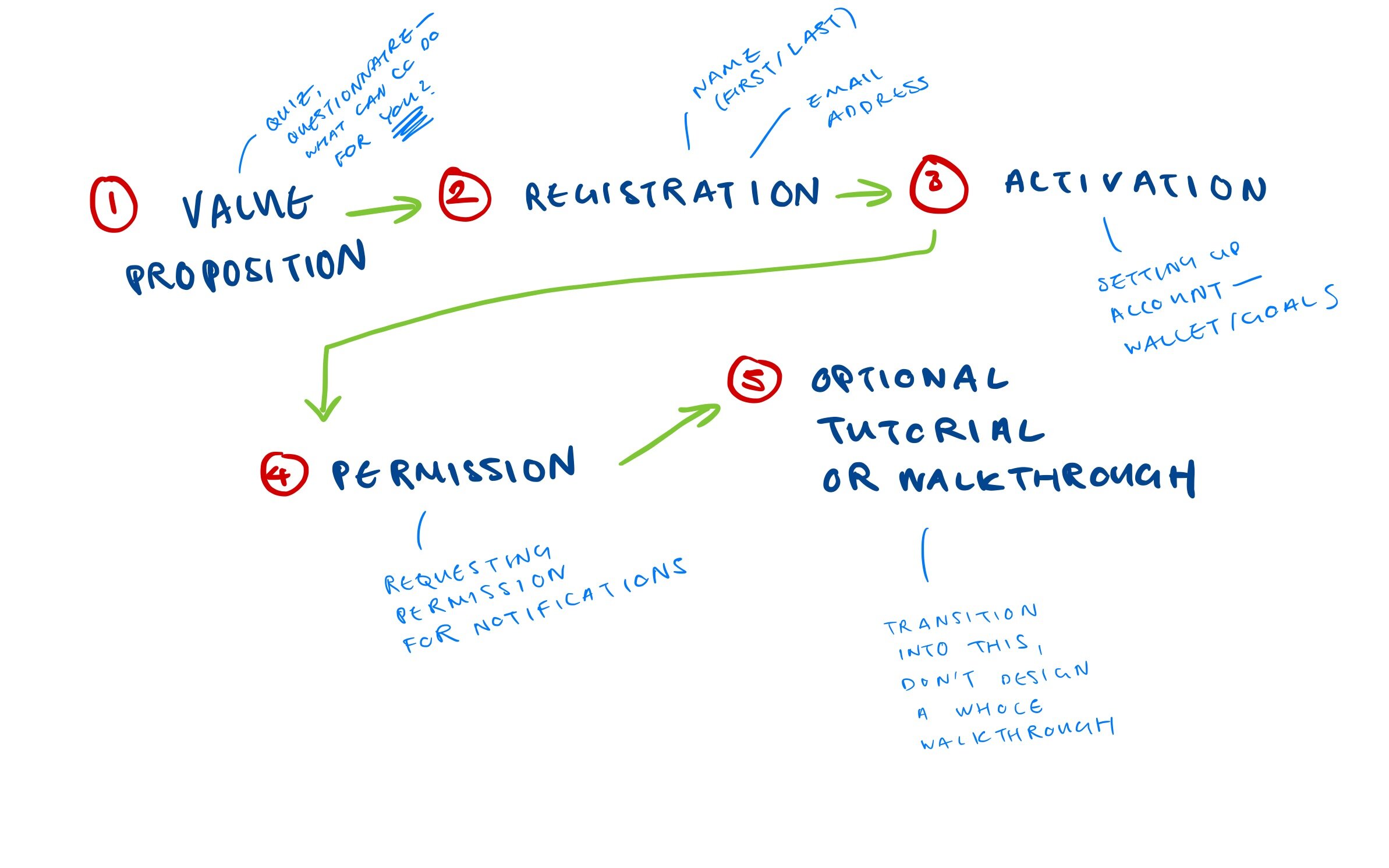
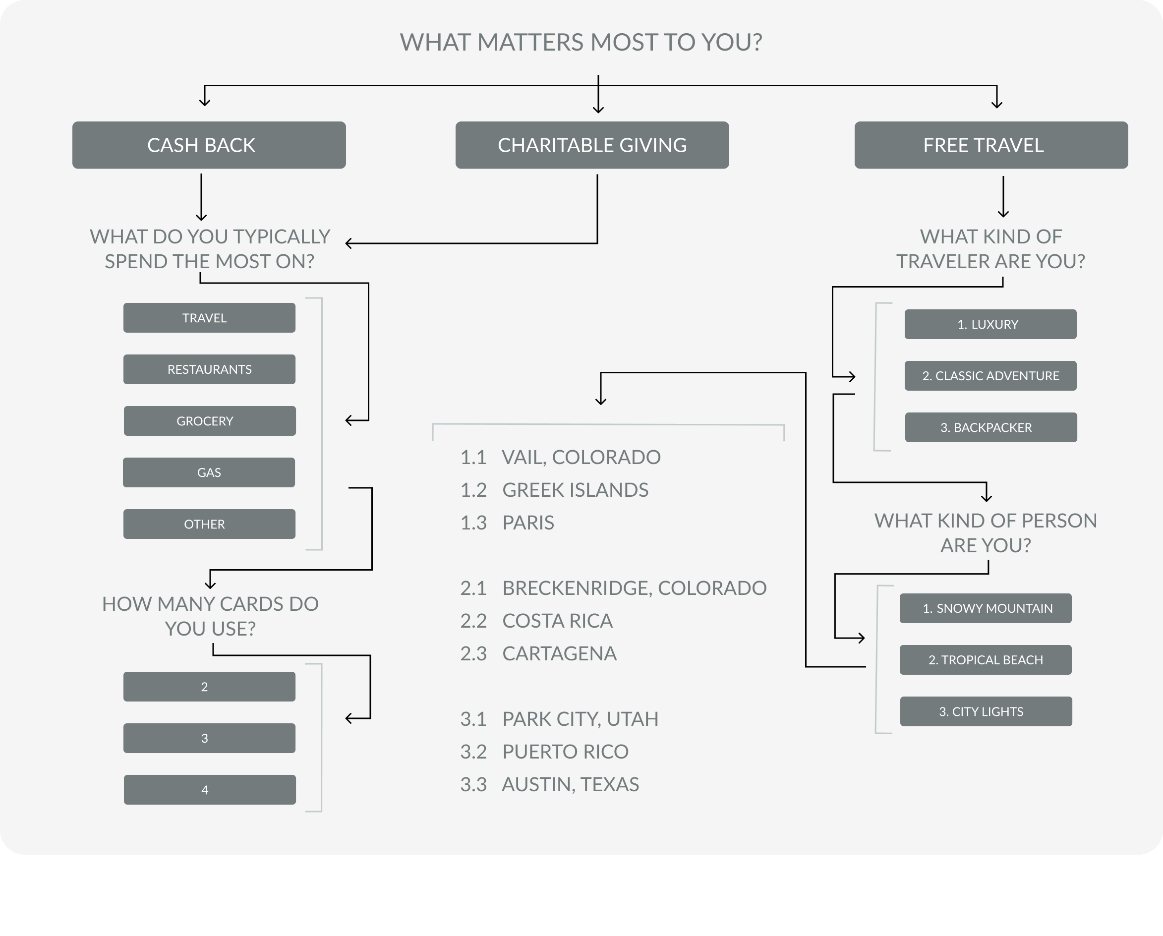
First, I identified five main elements of onboarding that needed to be included in my design, and determined their most effective order drawing from Competitive Analysis.
After brainstorming 25+ ideas, I proposed to incorporate a personalized questionnaire feature at the start of Card Curator's onboarding process in order to generate user excitement, activate user imagination, and demonstrate an engaging value proposition.
Keeping my user persona in mind, I drafted a rough user flow chart to help organize my ideas.
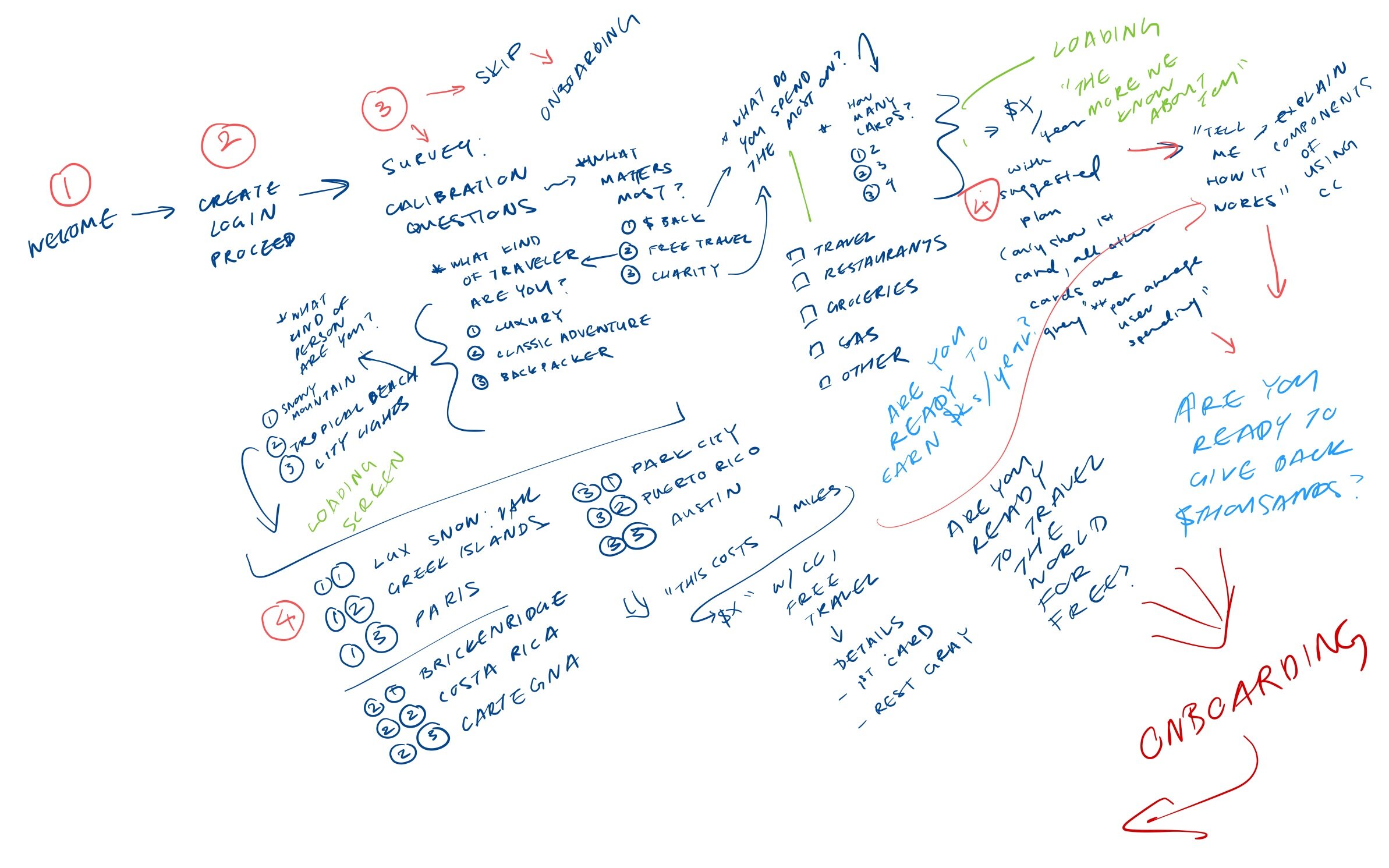
I then created an initial set of wireframe sketches in order to pitch my idea to managers and advisors within the company.
PROTOTYPE & TEST
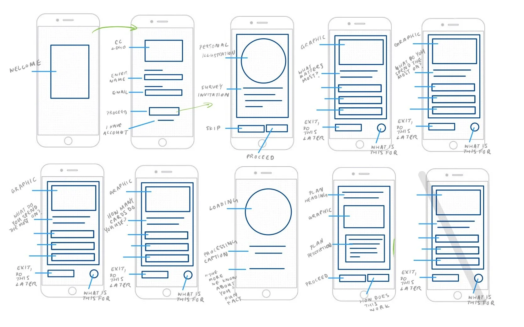
Low Fidelity Wireframes
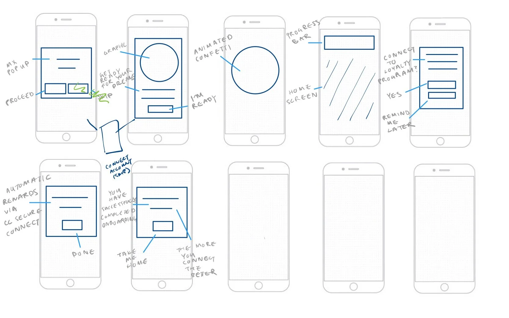
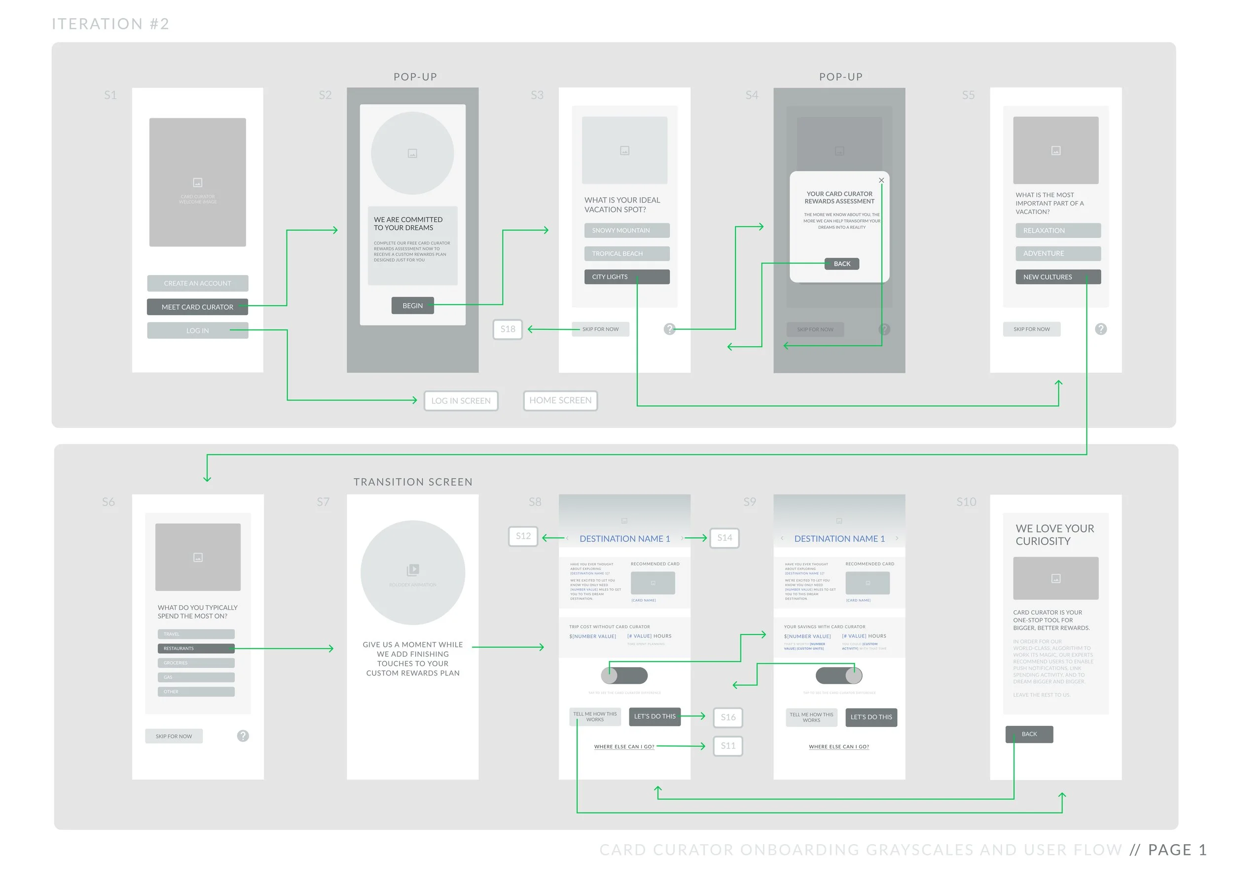
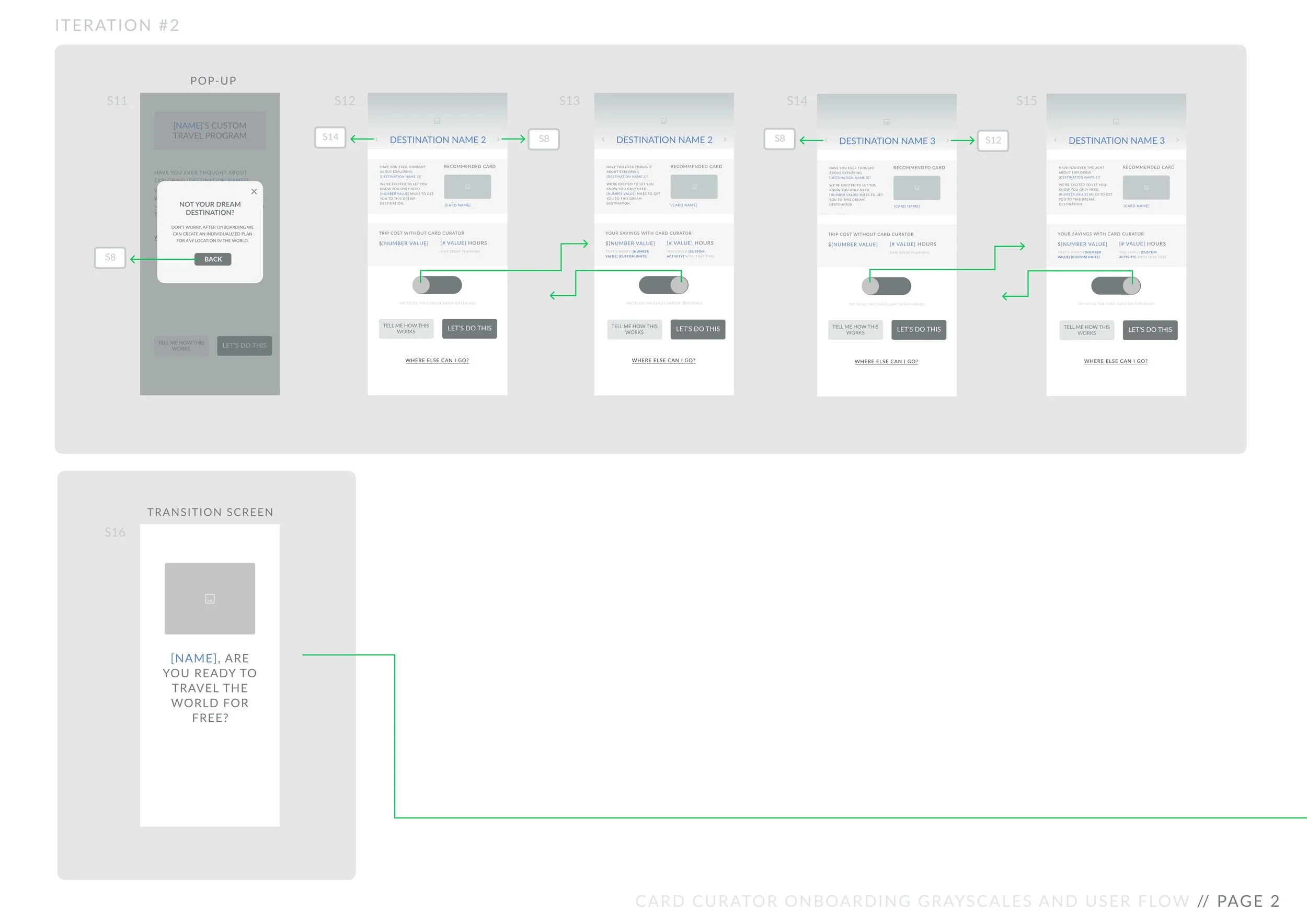
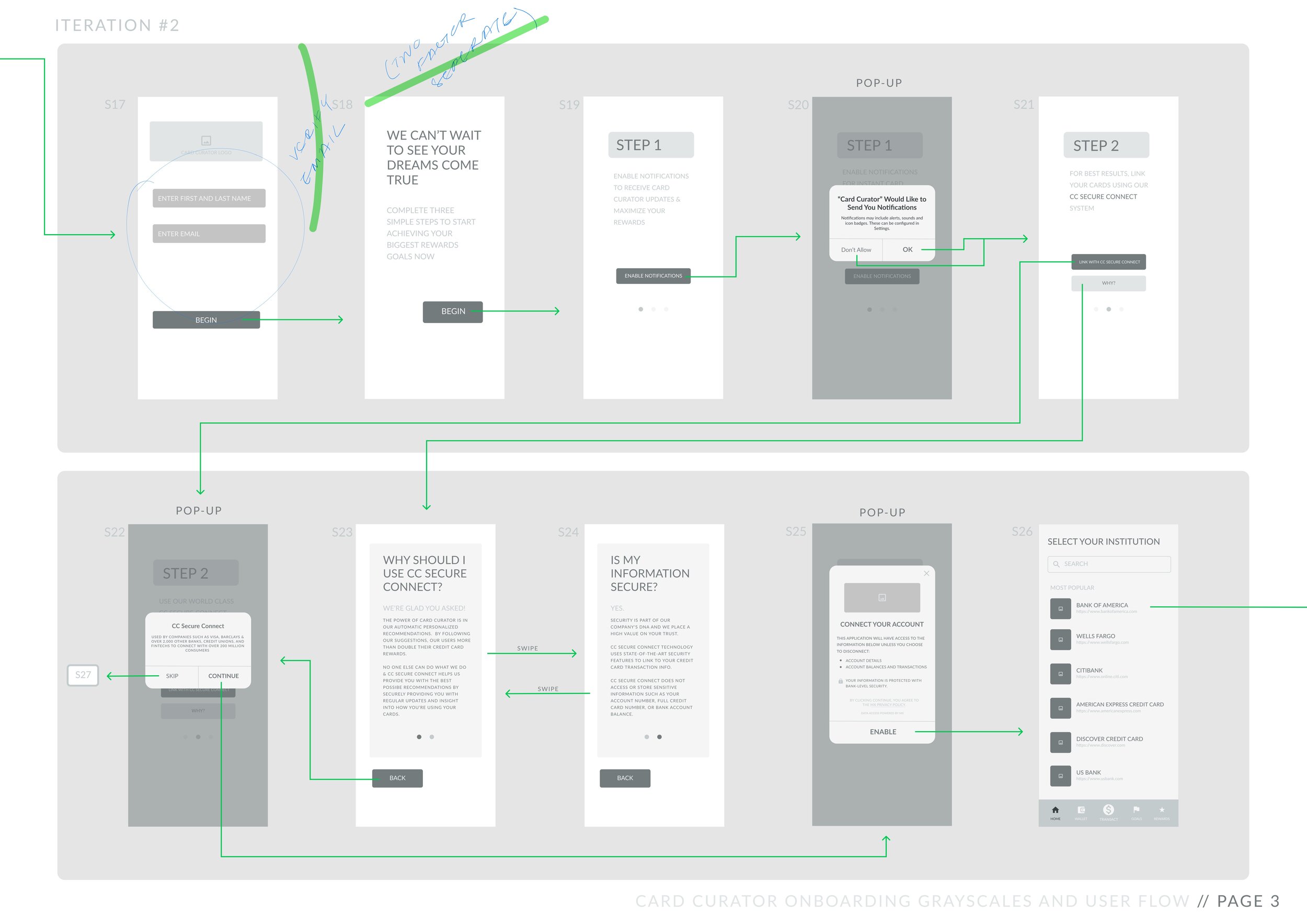
After receiving internal feedback and approval, I created two iterations of Low Fidelity Wireframes for testing.
Here are some of the notable considerations that were made during this process:
Organizing Objectives
I split onboarding into two main parts: assessment and setup.
While the assessment section is lighthearted and serves to help the user feel catered towards and eager to begin using Card Curator, the setup section includes notification enablement and spending activity connection.
I prioritized steps that would help the user envision their life if they continue to use Card Curator’s services as well as items necessary for the algorithm to function.
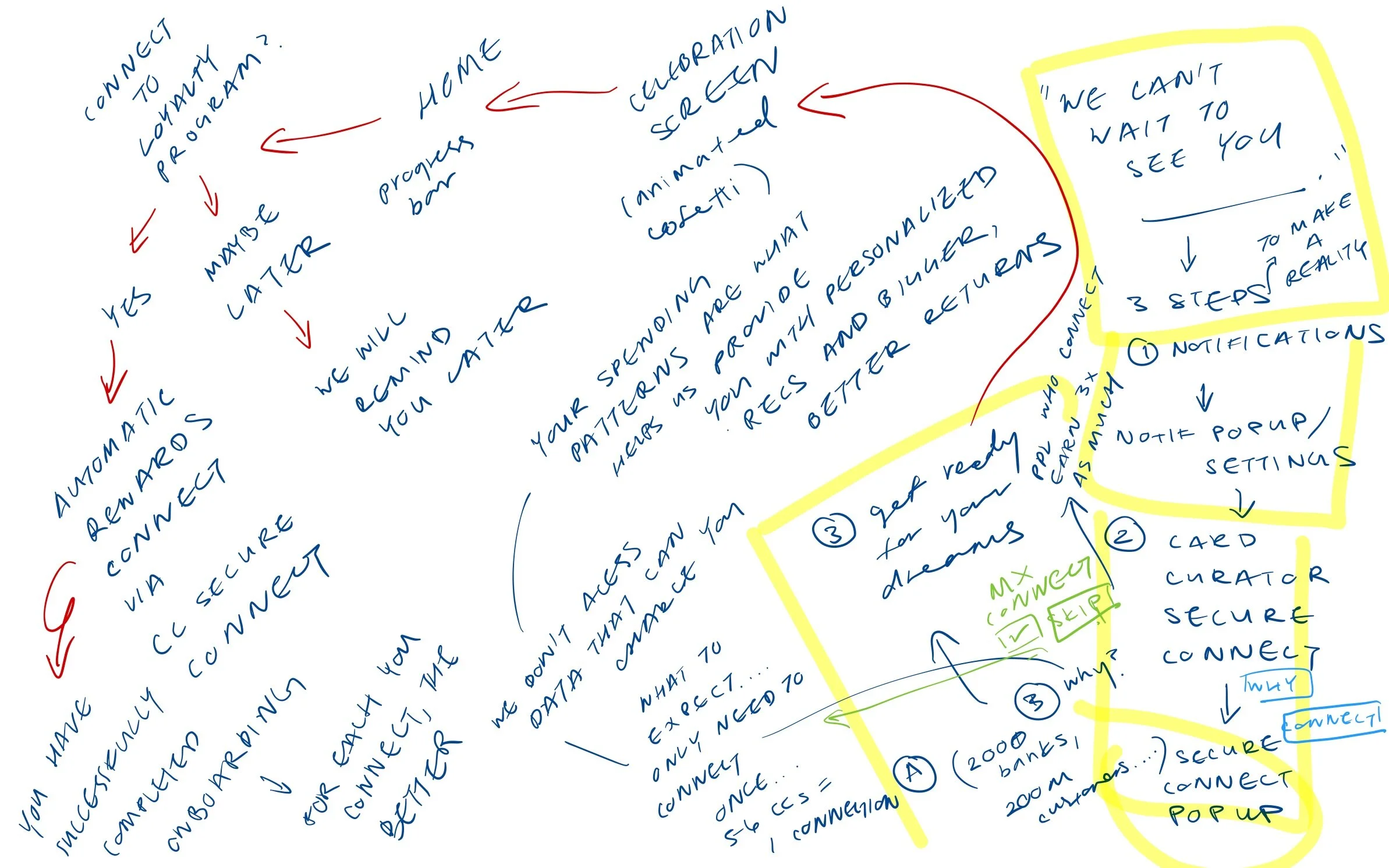
Generating Momentum + Changing Tone
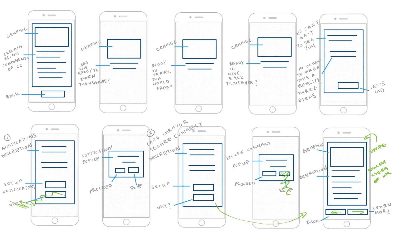
After setup, the user is presented with ‘tool tips’ designed to help teach them how to use different app functionalities. The user must also complete any residual, low priority setup steps (i.e., two factor authentication) which appear as pop-ups upon second and third use of the app.
In order to maintain user enthusiasm and momentum, I incorporated celebratory loading screens with copy and imagery designed to praise the user for completing different onboarding check points.
I also ensured that each onboarding step varied in level of effort and interest to help keep the user engaged. For example, the entire third step (3/3) of setup is tapping a CTA that affirms the user is ready for their dreams to come true.
Due to the time constraints of the upcoming release, I created a few iterations of a Low Fidelity Prototypes and begun user testing. Here is one of my first iterations:
PROTOTYPE & TEST
USABILITY INSIGHTS
I conducted three lightning rounds of User Testing, iterating from discovered feedback and pain points after each round.
One round consisted of a focus group of high frequency miles/points users, while the other two rounds consisted of individual user testing within our target market.
Here are a few of the final adaptations that were incorporated based on Usability Findings:
(Note: All images are from the second round of prototype testing.)
FOCUS ON TRAVEL
USABILITY FINDING
Users expressed that the 'charitable giving' and 'cashback' results screens upon taking the initial assessment were not as enticing as the 'travel' results screen.
While the original questionnaire asked if users were most interested in travel, cashback, or charitable giving, I ultimately decided to eliminate both cashback and charitable giving options to streamline development and focus on maximizing the quality of the travel screen.
CC SECURE CONNECT
Card Curator's initial setup process involved asking users to connect their spending activity via a platform called 'MX'. Without spending activity, Card Curator's algorithm cannot optimally function.
USABILITY FINDING
Users did not understand what MX was or why it was necessary. Moreover, users were not familiar enough with Card Curator to trust an additional third party platform. As a result, some users stopped setup after the MX pop-up.
In response, we decided to rebrand ‘MX’ to ‘CC Secure Connect’. We also included multiple ‘Tell Me More’ CTAs explaining the function and purpose of MX to help ease any residual distrust. The informational pop-up contains two pages; the second page designed to provide more information than the first for particularly skeptical users.
THE CARD CURATOR DIFFERENCE
USABILITY FINDING
Even after being presented with a suggested dream destination and how Card Curator would help them achieve the required amount of points and miles, some users still did not believe that Card Curator would make the travel process substantially easier.
In order to further highlight Card Curator’s value proposition of easy, free travel, I added a “See the Card Curator Difference” switch button which presents trip cost and time spent planning with and without the app’s services.
The switch button is designed to emphasize the opportunity cost of attempting to visit a dream destination without Card Curator’s algorithm and tools.
DESIGNING FOR DIFFERENT COMFORT LEVELS
USABILITY FINDING
Users who were familiar with points and miles hurtled through setup steps while users who were unfamiliar with these concepts wanted more time to digest and information regarding these steps.
In order to cater to different kinds of users who were equally important within our target market, I added the ability to temporarily skip certain steps (i.e., linking spending activity). I also divided informational screens and ordered them in level of detail so that only users who wanted to know more would see more in-depth screens while others could fly through onboarding.
DELIVERY & DEVELOPMENT
HIGH FIDELITY SCREENS
After testing and reiterating my low fidelity screens, I worked with a co-designer who was familiar with Card Curator’s existing Design System to develop High Fidelity Screens to deliver to the development team.
Here are a few of our key screens with changes made using our final round of user feedback:
REFLECT
TAKEAWAYS & NEXT STEPS
As somebody who is about to be propelled into my full adult life, I sometimes wonder what will happen to my dreams and passions that don’t fit into my new lifestyle or job description. Working on Card Curator’s onboarding was a special opportunity for me because it enabled me to help individuals create beautiful life memories that otherwise might feel unrealistic or out of reach. Ultimately, it meant a lot to me to be able to design something that aims to help people reconnect with a part of themselves that believes that crazy things—like free exploration of the world—can be possible.
NEXT STEPS
Designing onboarding inevitably rewrote the narrative of the rest of the mobile app. For example, how might the user’s assessment results be incorporated post-onboarding? After I handed off the onboarding screens to development, I was fortunate enough to receive the opportunity to redesign Card Curator’s goal setting and profile processes as well.
As Card Curator’s onboarding flow continues to evolve throughout future releases, I hope that it will continue to embrace the inherent wanderlust entwined with travel and ignite a sense of curiosity within users. I imagine that this might involve more complex travel assessment questions, an increase in data collected from the user, and accessibility considerations. I also wonder in what other ways imagining and dreaming can be incorporated into the mobile app’s user flow outside of onboarding.
Thanks for reading! Still curious?

